
I have recently taken an interest in cartography, and have explored that interest through an Intro to Geographic Information Systems (GIS) course at EKU. We used ESRI’s ArcMap and explored GIS fundamentals such as creating layers, vectorizing raster data, developing classes for data visualization, and basic spatial analysis tools. The class provided most of the data that we worked with, but I have made a few maps in my own spare time and am consistently experimenting with the software. I am interested in demographic maps that visualize stats such as population growth, voter turnout, median household income, education levels, etc., so most of my GIS endeavors center on such data. Below are some maps I have made along with short descriptions of processes used to make them.
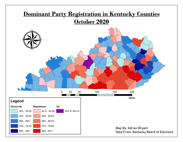
To make this map, I joined an .xls file of voter registration data from the Kentucky Board of Elections with an attribute table embedded in a Kentucky counties layer provided by my Intro to GIS instructor. I created separate attribute fields for percentages of Republicans and Democrats registered in each county, using the Field Calculator to calculate those averages (the KY Board of Elections only provided raw numbers). I created two layers, separating majority Democratic counties from majority Republican counties by using the “exclusion” feature in the Symbology tab within the layers’ properties.
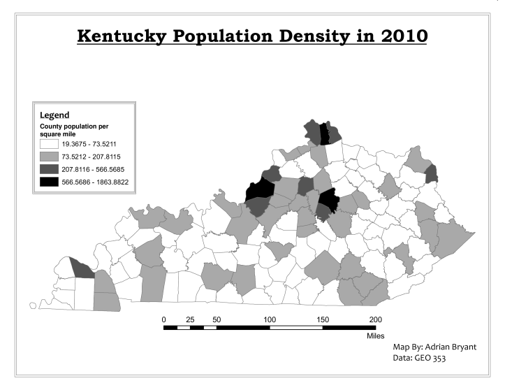
This map was part of a weekly assignment in the Intro course, where we used the Field Calculator to calculate the population density of each county (the Attribute Table only contained raw population and square mileage separately). We were then tasked with showing the data using Quantile, Equal Interval, and Natural Breaks class-types. This particular map uses Natural Breaks.
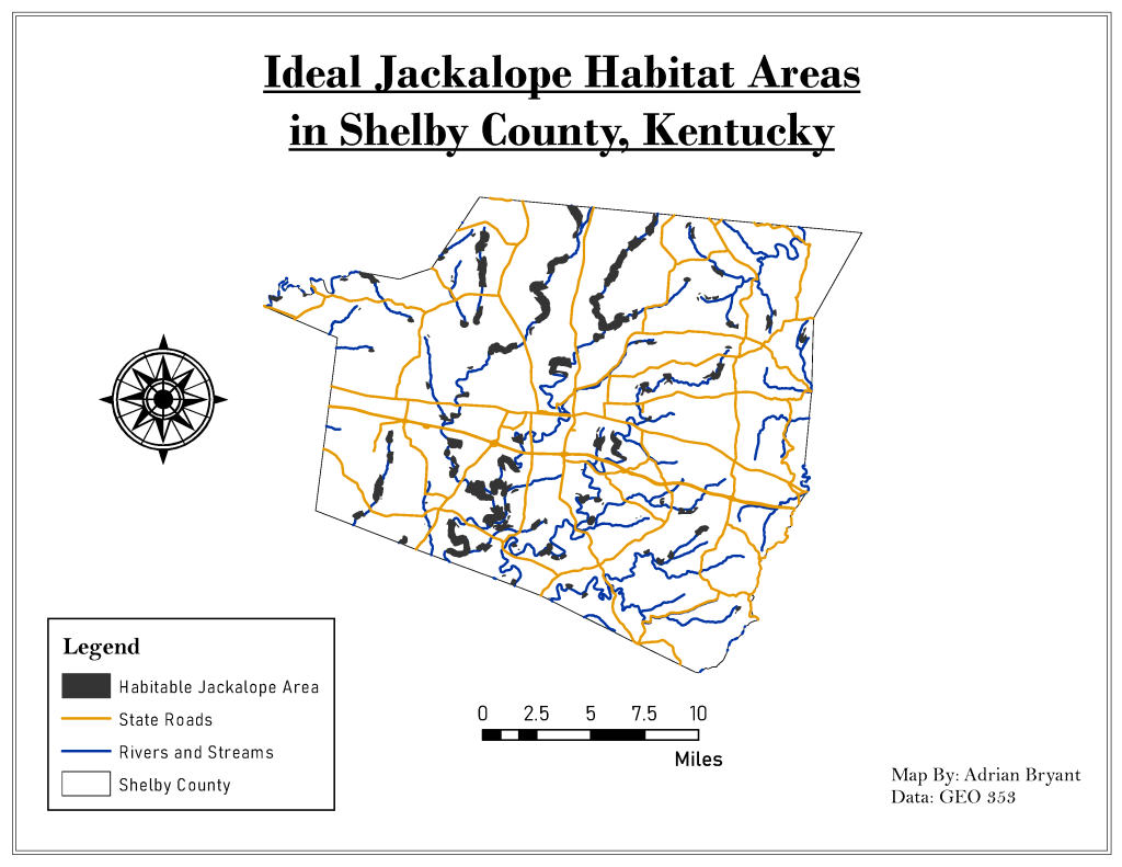
This map, from our final class assignment, shows where in Shelby County the fictional jackalope could happily live. I used Shelby County’s borders to clip larger data files of schools, roads, rivers, land coverage, and incorporated cities from the entire state of Kentucky. I used the buffer feature to buffer 500 ft. from crops, 1000 ft. from rivers/streams, 2000 feet ft. from roads, 3000 ft. from schools, and 2000 ft. from incorporated cities. Since the jackalope wants to be close to rivers/streams and crops but away from roads, schools, and cities, I used the Erase feature in ArcMap to Erase the buffers for the less desirable jackalope areas. I then intersected the Erased layers with the buffers from rivers and crops, creating a layer for the jackalope’s ideal living spaces.
